
Flat Design
This Project was a minimalist flat design project, where I had to come up with different items that represented me. I particularly enjoyed this one, because i love a minimal design and like to create them whenever i get the chance.
Gamecube and House Tutorial
For an Honors project I was tasked with making 2 tutorials on how to make something. I decided on making a house and then later on made one for a flat design of a Gamecube. Both are tutorials for Adobe Illustrator, so make sure you have that if you want to follow along. Below are 2 downloads for the tutorials I made, if you want to check that out.
For an Honors project I was tasked with making 2 tutorials on how to make something. I decided on making a house and then later on made one for a flat design of a Gamecube. Both are tutorials for Adobe Illustrator, so make sure you have that if you want to follow along. Below are 2 downloads for the tutorials I made, if you want to check that out.

|

| ||||
|
Final Project: Cat Animation (Spring 2021)
For my final project in 2021 I was given a lot of freedom with whatever I decided to make, so I made a little animation of my cat. While he walks, he turns from a frame, to an outlined gray shape, to a colored shape, to himself. I think this project really difficult but really worth it to finish, as its a good representation of my abilities in Adobe Animate. |
|
|
|
Logo Design
This project was a logo design project for a home cleaning company. I designed 5 logos and built further on one of the 5, as you tend to do with logo packages. In conclusion, I don't like logo design very much, 5/10. |
|
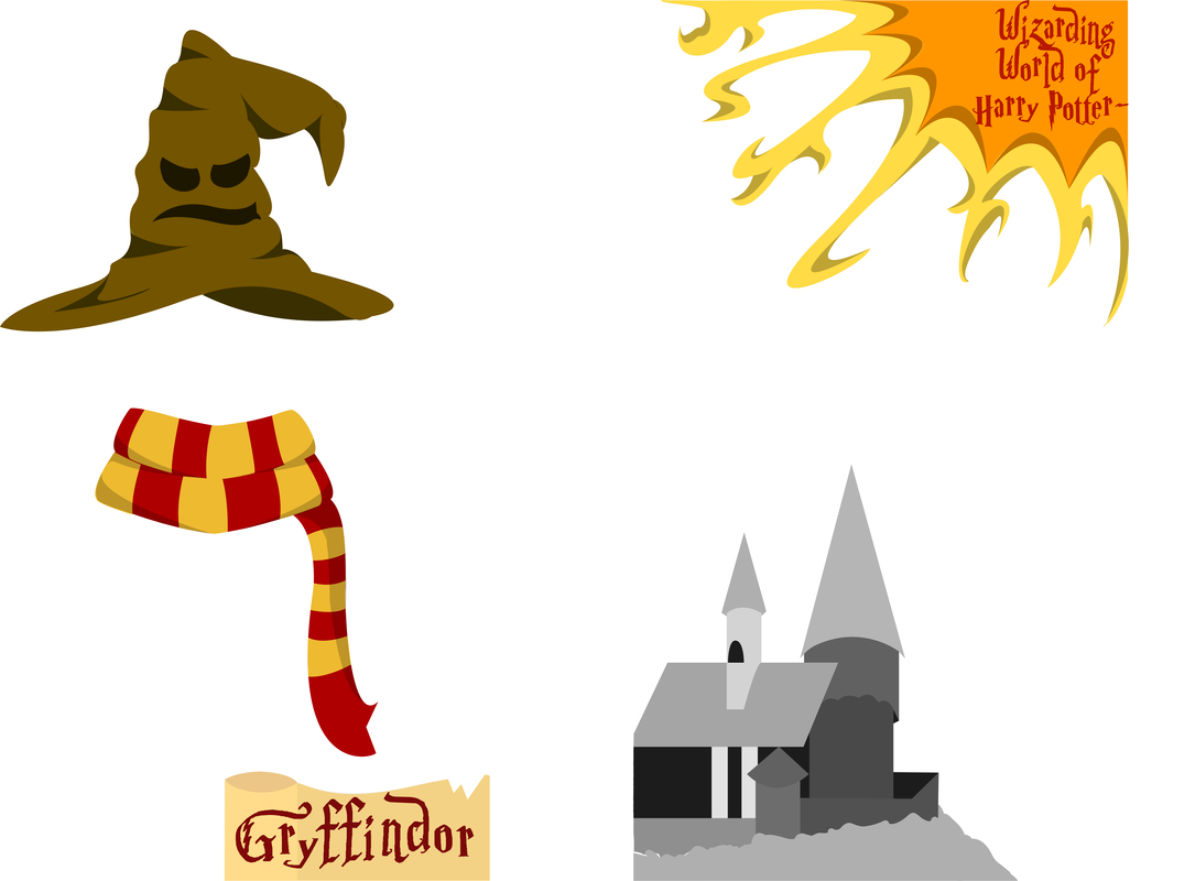
Geofilters: Harry Potter edition
For this project, I was tasked with designing 2 geofilters for a location of my choice. I'm not familiar with geofilters so I don't know how well this worked out but I think I did fairly well, 6/10. |
|
|
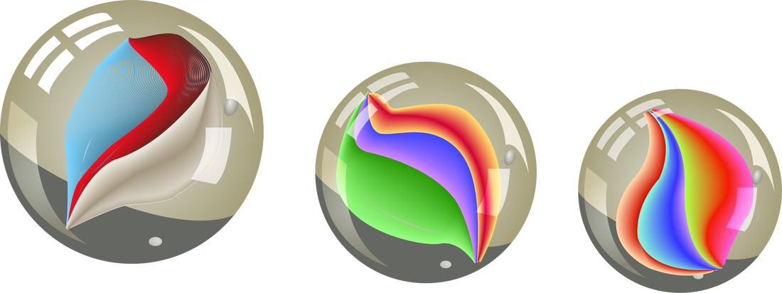
Marbles
A project in which I replicated a process 3 times to make some real looking marbles. I really enjoyed the results and color creativity in this one, but I can't seem to see them as marbles after going through the process of making them. |
|
Retro Logo Badge
A retro looking badge I created based on a template design in an Advanced Studies class. I took a fair amount of creative liberties with this one, but I really had no clue what I was doing, so I would probably fine-tune this one a bit more. |
|
|
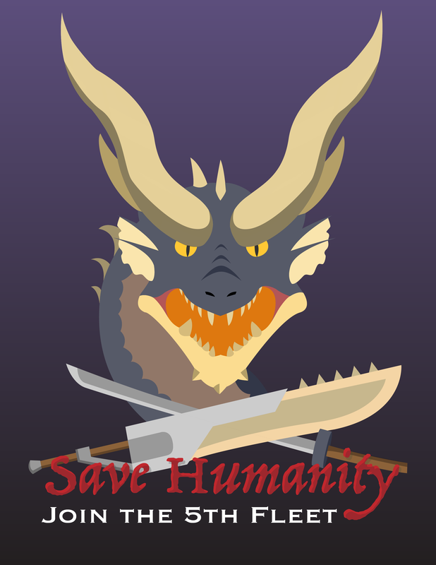
Propaganda Poster
In our Advanced studies class, we were tasked with creating some kind of propaganda poster. Being the Monster Hunter-obsessed person i am and with the final monster Fatalis being dropped Oct 1st, I decided to make a propaganda poster for said monster. I really enjoyed this project, and I would love to do it again. |
|
Typography Project
We were tasked with doing a project in which we apply effects to different words in quotes, so I chose a fairly medium sized quote. I would do this one again with more effects on the fonts, I just had a lot of assignments going on at the time. This was a fairly enjoyable project tho. |

|
Custom Card deck Project
For this project we were told to create an entire 52 card deck, as well as a card back and a joker card. I didn't actually work on it very often, but when I did, I worked for hours. For this one it was actually pretty hard to come up with that many designs due to the amount of characters in Risk of Rain 2, but luckily in the original game there were enough to meet the amount needed. This Project was probably one of my most stressful, but it also would've been the most satisfying. I still want to go back to change some details personally, but thats for a later time.
For this project we were told to create an entire 52 card deck, as well as a card back and a joker card. I didn't actually work on it very often, but when I did, I worked for hours. For this one it was actually pretty hard to come up with that many designs due to the amount of characters in Risk of Rain 2, but luckily in the original game there were enough to meet the amount needed. This Project was probably one of my most stressful, but it also would've been the most satisfying. I still want to go back to change some details personally, but thats for a later time.

|
Product Label Design group project
This project was one of the more difficult ones, because of group difficulties, but its also one i'm proud of. I think what i'm most proud of is the way i matched the back to what most products look like, but I'm also very proud of my usage of our color scheme on the front. I actually kind of struggled to get the gray gradient on the front to work, because i didn't realize that it just blends that way when you make a gradient between 2 very similar colors. If I could do it again, I would probably put more detail or color into the front, it still looks kind of simple to me. Overall though, this project was really fun to work through with my group. |
|
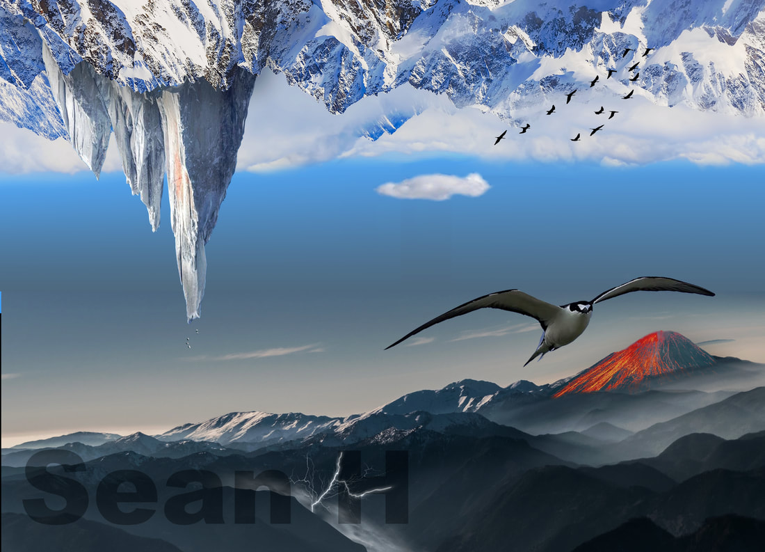
Surreal Photo-merge Project
For this project we were tasked with merging many different photos using different techniques in Adobe Photoshop, to make a surreal picture. I had to brainstorm for a while on this one, but I'm really proud of how it resulted with the blend in the middle. I'm also proud of how well the volcano blended in the background and the lightning at the bottom, I wasn't sure how good it would look. Unfortunately, I found it really difficult to find images when I was trying to work, so I had to scrap a lot of ideas I wanted to do. I had to use a bit of imagination once I had everything assembled and there were still things I felt like I should add though. If I could change anything about this afterwards, it'd be the shadow between the big mountain coming down from the top right and the mountain overlapping it. I thing it looks out of place or at least fake. It may have been difficult to come up with ideas for this project, and it may have been a tough challenge being one of my least used programs, but it sure was a fun project that i'd suggest for others. |
|
